
Hey kids!! Let's click on the Geographic Hate Map!
Geotagging shows where the haters are
By jennifer-wadsworth@blog.timesunion.com (Jennifer Wadsworth)
A group of academics, adorably and somewhat mysteriously dubbed Floating Sheep, came out with a study called “Geography of Hate,” a color-coded image that maps out racist, homophobic and anti-disability tweets.
California’s Humboldt State University helped the group analyze geotagged tweets, manually reading through 150,000 containing some kind of slur (read individually to determine if the context was, indeed, mean-spirited). They then figured the ratio of offensive posts compared to overall tweets in the country.
“Hateful tweets were aggregated to the county level and then normalized by the total number of tweets in each county,” the group writes in a detailed explanation of the study. “This then shows a comparison of places with disproportionately high amounts of a particular hate word relative to all tweeting activity.”
Most of the hate-spewing had to do with race, using disparaging terms for Latinos, blacks and some Asians. Next highest number were homophobic tweets. And posts about the handicapped used the word “cripple.” If you want to see the terms used (warning: highly offensive language) and the frequency by region, click here to view the interactive map.
Before we start harping on the right side of the country (and parts of Idaho and California east of Sacramento), though, consider another study, this one with a more global outlook. Despite their penchant for less-than-savory 140-character-or-less rants, Americans overall are among the most tolerant people in the world, according to some Swedish researchers.
A survey of 80 countries found Western nations, including United Kingdom, Canada, Australia and, yes, the U.S., are the most accepting. Hong Kong, Jordan and Bangladesh, conversely, were named the least tolerant.
Basically, the survey says, economically free nations tend to be more accepting.
The World Value Survey asked people who they’d refuse to live next to. The countries with the highest number of respondents citing “people of a different race” were named least tolerant. Justifiably so.
Nearly 72 percent of Hong Kong residents surveyed said they refused to live next to someone of another race. In the U.S., less than 4 percent said the same.
“Europe is remarkably split – the west of the continent is generally more tolerant than the east, but France is a striking outlier with 22.7 percent of the French rejecting neighborhood diversity,” the Daily Mail writes.
Americans may mouth off like a bunch of racist nuts online, but at least they’re generally better about actually co-existing than other places.
source
Is cripple really a hateful term?
How do you Rate in the Geography of Hate

Re: How do you Rate in the Geography of Hate
Is it supposed to do something?
Sometimes it seems as though one has to cross the line just to figger out where it is

Re: How do you Rate in the Geography of Hate
That's uh, just a little biased....
Homophobia, Racism, and Disability make the list of "hate" comments being monitored....(and if you're going to measure "hate" based on sexual orientation, how about adding "breeders" to the list?)
But nothing about religious slurs or bigotry....
Also, under racism, racist terms applied to whites don't make the list...
(Curiously, they don't monitor misogyny...maybe they didn't want to do that because they were afraid that a lot of it would show up among minority groups)
This thing is weighted to try to measure only the "hate" of straight, white, right-wingers....
There are plenty of other "haters" about....
Last edited by Lord Jim on Sat May 18, 2013 12:38 am, edited 1 time in total.


-
oldr_n_wsr
- Posts: 10838
- Joined: Sun Apr 18, 2010 1:59 am
Re: How do you Rate in the Geography of Hate
I guess I'll have to learn how to tweet, Long Island is under-represented.

Re: How do you Rate in the Geography of Hate
If you're talking about the map, if you click on the menu at the top and choose from it, it narrows down the geographical areas of the country that supposedly made those "Hateful Tweets".Rick wrote:Is it supposed to do something?
Re: How do you Rate in the Geography of Hate
It could be worse, wait till the West Coast learns how to tweet...
Sometimes it seems as though one has to cross the line just to figger out where it is
Re: How do you Rate in the Geography of Hate
We just twat out here in Cali-land.
Your collective inability to acknowledge this obvious truth makes you all look like fools.
yrs,
rubato
Re: How do you Rate in the Geography of Hate
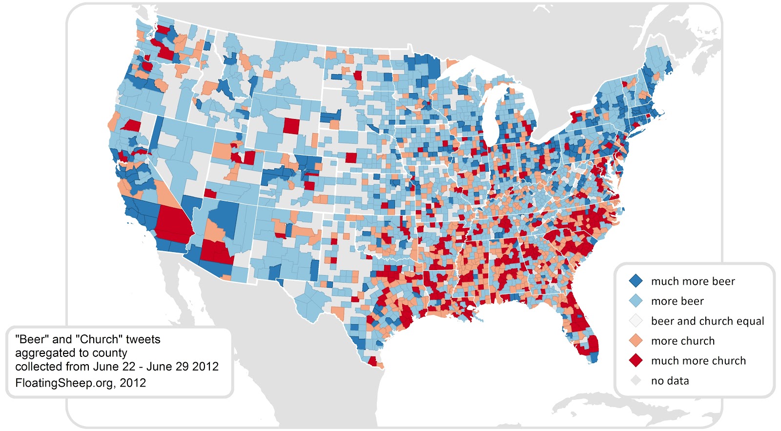
Very cool research. Check out the "beer vs church" map!

"More Beer" and "Much more beer" correlate strongly with desirable areas.
And the "cheap marijuana" map is fun too.
http://users.humboldt.edu/mstephens/
yrs,
rubato
"More Beer" and "Much more beer" correlate strongly with desirable areas.
And the "cheap marijuana" map is fun too.
http://users.humboldt.edu/mstephens/
yrs,
rubato
Last edited by rubato on Sun May 19, 2013 7:17 pm, edited 1 time in total.
Re: How do you Rate in the Geography of Hate
LOL !!!Very cool research.
Wow, given his record, color me shocked that rube would look at a blatantly biased, cherry picked, completely non-scientific collection of pseudo-data that proves absolutely nothing and label it, "very cool research"....
That's our Mr. Science....
Re: How do you Rate in the Geography of Hate
I need a new computer..........all I see is this:
Your collective inability to acknowledge this obvious truth makes you all look like fools.
yrs,
rubato
-
Econoline

- Posts: 9607
- Joined: Sun Apr 18, 2010 6:25 pm
- Location: DeKalb, Illinois...out amidst the corn, soybeans, and Republicans
Re: How do you Rate in the Geography of Hate
http://www.floatingsheep.org/
I agree that some of their maps are pretty cool. And Jim, lighten up. There's a difference between "cool" (or "fun") and "scientifically meaningful".
Here's another one. (I can't get it to display any smaller, so you'll have to right-click on the image then select "Open image in new tab" in order to see the whole thing.)

At FloatingSheep, we're willing to search for and analyze almost anything that falls within the realm of human experience. Sometimes this is mundane (pizza) and sometimes it is contentious (abortion) but most of the time it falls somewhere in between. Such as, where can I get a drink?
I agree that some of their maps are pretty cool. And Jim, lighten up. There's a difference between "cool" (or "fun") and "scientifically meaningful".
Here's another one. (I can't get it to display any smaller, so you'll have to right-click on the image then select "Open image in new tab" in order to see the whole thing.)
People who are wrong are just as sure they're right as people who are right. The only difference is, they're wrong.
— God @The Tweet of God
— God @The Tweet of God
Re: How do you Rate in the Geography of Hate
It's not the "cool" part I objected to Econo;....
It's being ignorant enough to label this as "research" that struck me...
Especially coming from a supposed scientist....
And as for "lightening up", I don't get that comment....
I thought it was pretty clear that I found his characterization quite amusing...
It's being ignorant enough to label this as "research" that struck me...
Especially coming from a supposed scientist....
And as for "lightening up", I don't get that comment....
I thought it was pretty clear that I found his characterization quite amusing...
Re: How do you Rate in the Geography of Hate
She and her group have found an interesting and novel way to use very recent technology to look at society. It is akin to the invention of the microscope and the telescope; a new way of looking at things, a way which we are just beginning to understand and learn how to employ.
As pedagogues they have done a brilliant job of finding things to search for which engage the interest of a lot of people, whether they are in the social sciences or not.
It is very good research at the very beginning of a new way of doing things. The critique of the method is always developed concurrently with the method itself.
I bet she, or someone in her field, gets a MacArthur grant for it.
yrs,
rubato
Re: How do you Rate in the Geography of Hate
I could see this happening.
Interesting Map.
btw: On the Map that Econo posted, Hawaii was almost a soid green................guns......guns......guns.........guns
Interesting Map.
btw: On the Map that Econo posted, Hawaii was almost a soid green................guns......guns......guns.........guns
Your collective inability to acknowledge this obvious truth makes you all look like fools.
yrs,
rubato
Re: How do you Rate in the Geography of Hate
"Floating Sheep" = 100
LJ = 0
http://www.floatingsheep.org/
_____________________________
yrs,
rubato
LJ = 0
http://www.floatingsheep.org/
_____________________________
FAQ: The Geography of Hate
Dear Readers,
Thanks to everyone (well, almost everyone) for their comments and constructive critiques on our Geography of Hate map. In light of all of the different directions these comments have come from, we wanted to respond to some of the more common questions and misunderstandings all at once. Before commenting or emailing about the map, please keep the following in mind...
1. First, read our original post. Second, read through this FAQ. Third, read the "Details about this map" section included in the interactive map, itself. We specifically spent time on these things in order to explain our approach, and they go into some detail about the methods we used. Nearly all of the critiques of our map are already included in one of these venues. We're happy to engage and confident in our methodology (not that any approach is perfect), but please, use the skills your first teacher gave you and take the time to read.
2. If you are offended by these words, and we sincerely hope that you are, remember that they are the object of a research project. As such, we felt compelled to reproduce the words in full in order to be as clear as possible about our project. While we agree that the use of these slurs can be hurtful to some, especially the groups that they are targeted at, we believe that there is a difference between including them as the object of our study and using them as they are 'meant' to be used.
3. The map is based solely on geocoded data from Twitter, and does not reflect our personal attitudes about a given place. The map represents real tweets sent by real people, and is evidence that the feeling of anonymity provided by Twitter can manifest itself in an ugly way. If you feel that the place you live is more or less racist than somewhere else and this isn't reflected in the map, please start a conversation with your community about these issues.
4. In order to produce this map, we took the number of geotagged hateful tweets, aggregated them to the county level and then normalized this count by the overall number of tweets in that county. This means that the spatial distributions you see for the different variables are decidedly NOT showing population density. As we mentioned above, this is clearly stated in all of the previously written material accompanying the map. And because we are specifically looking at the geographic patterns of Twitter activity, it makes more sense to normalize by overall levels of Twitter activity than by population.
Were that not enough, however, the fact that there is so little activity on the map in California - home to an eighth of the entire US population, including the cities of Los Angeles, San Francisco and San Diego - should be a clue that something else besides population is at work in explaining these distributions. While we share with the infamous xkcd cartoon a distaste for non-normalized data, just because you thought for a second that maybe it was relevant in this case doesn't make it so. There are many possible explanations for some of the distributions that you can see, and we don't pretend to have all of the explanations. But population just isn't one.
5. This map includes ALL geotagged tweets for each of these words that were determined as negative. This is not a sample of tweets containing these words, but rather the entire population that meets our criteria. That being said, only around 1.5 % of all tweets are geotagged, as it requires opting-in to Twitter's location services. Sure enough, that subset might be biased in a multitude of ways when compared with the the entire body of tweets or even with the general population. But that does not mean that the spatial patterns we discover based on geotagged tweets should automatically be discarded - see for example some of our earlier posts on earthquakes and flooding.
6. 150,000 is in no way a "small" number. Yes, it is less than the total population of earth. Yes, it is less than the number of atoms in the universe. But no, it is not small number, especially as it is the total population of the phenomenon rather than a sample (see #5). And were one to extrapolate out that, considering these 150,000 geotagged hateful tweets are only around 1.5% of the total number of hateful tweets, the actual number of tweets (both geotagged and not) containing such hateful words is quite a bit larger. Regardless, we think that 150,000 is a sufficiently large number to be quite depressed about the state of bigotry in our country.
7. Furthermore, given that each and every geotagged tweet including the words listed was read and manually coded by actual human beings (if you consider undergraduates to be human beings!), rather than automatically by a piece of software, 150,000 isn't an especially small number. For students to read just these 150,000 tweets, it took approximately 150 hours of labor. This isn't insignificant.
8. The original lists of words included were derived from http://en.wikipedia.org/wiki/List_of_ethnic_slurs and http://en.wikipedia.org/wiki/List_of_LGBT_slang and included the following words:
bitch
nigger
fag*
homo*
queer
dyke
Darky OR darkey OR darkie
gook*
gringo
honky OR honkey OR honkie
injun OR indian
monkey
towel head
Wigger OR Whigger OR Wigga
wet back OR wetback
cripple
cracker
honkey
fairy
fudge packer
tranny
A * indicates a list of lexeme variations was used, which accounts for alternate spellings of words. For example, "fag" was not just "fag," but also "fags", "faggot", "faggie", and "fagging", among other things. All geotagged tweets containing these terms were examined. All tweets that were not used in a derogatory manner were discarded during coding, and as a result some words no longer achieved a minimum number to be displayed on the map. For example, honky/honkey/honkie was discarded, as most of the tweets were positive references towards honky-tonk music and not slurs aimed at white people.
In the end we were also constrained to words that could be manually coded, and words that could not. For instance, the 5.5 million tweets with reference to "bitch" were excluded from the list. Students were paid roughly $10 per 1000 coded tweets, and therefore including the word "bitch" alone would have cost roughly $55,000 to manually check for sentiment. Tranny/tranney would have been under $200. While we're obviously interested in including a wider range of hateful terms in our analysis, our research funds, and thus the scope of this project, are extremely limited. It's not like we have billions of dollars in funding lying around. If you feel strongly, feel free to donate to http://humboldt.edu/giving. and enter "The Geography of Hate Project" in your comments.
9. If you are a disgruntled white male who feels that the persistence of hatred towards minority groups is a license to complain about how discrimination against you is being ignored, just stop. You can refer to all of our previous commentary on this issue from November. Though we have typically refrained from deleting asinine comments to this effect - those who choose to make these comments do more to prove themselves to be fools than we ever could - we fully reserve the right to delete any and all comments we believe to be unnecessary.
yrs,
rubato
Re: How do you Rate in the Geography of Hate
Indian is on the list?
What are people from India suppposed to be referred as?
What are people from India suppposed to be referred as?
Your collective inability to acknowledge this obvious truth makes you all look like fools.
yrs,
rubato
Re: How do you Rate in the Geography of Hate
Cab Drivers...dales wrote:Indian is on the list?
What are people from India suppposed to be referred as?
Re: How do you Rate in the Geography of Hate
That or Software Engineers.
Look Out for the Chinese and Indians, the 21st Century will belong to them.
Look Out for the Chinese and Indians, the 21st Century will belong to them.
Your collective inability to acknowledge this obvious truth makes you all look like fools.
yrs,
rubato
Re: How do you Rate in the Geography of Hate
CHURCH OR BEER
more church were I live......CoCoCo
more church were I live......CoCoCo
Your collective inability to acknowledge this obvious truth makes you all look like fools.
yrs,
rubato
Re: How do you Rate in the Geography of Hate
It's every bit as valid from a "research" point of view, as an opt-in "poll" run on the FOX News website, or one run on MSNBC's site....She and her group have found an interesting and novel way to use very recent technology to look at society.
Which is to say it has no genuine "research" validity whatsoever...
Rube likes it, because the slanted, cherry picked nature of the thing is re-affirming to his own pre-conceived bigoted, prejudices and biases....
Had that not been the case, he'd be rejecting it out of hand, and saying that the whole thing was full of shit...