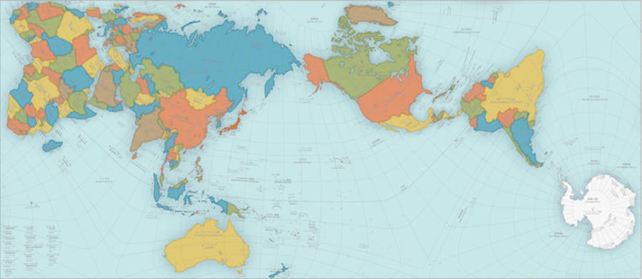
You probably don’t realize it, but virtually every world map you’ve ever seen is wrong. And while the new AuthaGraph World Map may look strange, it is in fact the most accurate map you’ve ever seen.
The world maps we’re all used to operate off of the Mercator projection, a cartographic technique developed by Flemish geographer Gerardus Mercator in 1569. This imperfect technique gave us a map that was “right side up,” orderly, and useful for ship navigation — but also one that distorted both the size of many landmasses and the distances between them.
To correct these distortions, Tokyo-based architect and artist Hajime Narukawa created the AuthaGraph map over the course of several years using a complex process that essentially amounts to taking the globe (more accurate than any Mercator map) and flattening it out:
Narukawa’s process indeed succeeded in creating a map that no longer shrinks Africa, enlarges Antarctica, or minimizes the vastness of the Pacific — and the list goes on.
In recognition of Narukawa’s success, he’s now beaten out thousands of other contestants to receive this year’s Grand Award from Japan’s Good Design Awards, and his map is featured in textbooks for Japanese schoolchildren.
“AuthaGraph faithfully represents all oceans [and] continents, including the neglected Antarctica,” according to the Good Design Awards, and shows “an advanced precise perspective of our planet.”
Furthermore, according to Narukawa, his map means a lot more than just a faithful cartographical representation of our planet. Because Earth is now facing down issues like climate change and contentious territorial sea claims, Narukawa believes that the planet needs to look at itself in a new light — a view that perceives the interests of our planet first and its countries second.
"Hang on while I log in to the James Webb telescope to search the known universe for who the fuck asked you." -- James Fell
Me, I liked a map that Comedy Central tv was using for a while. I think it was a mercator projection, with the south pole at the top and centered on Australia.
Where's your photo from, RT? This one is earth from space, and as you can see, South America is shaped like the AuthaGraph map. Yours is different. Puzzling . . .
For me, it is far better to grasp the Universe as it really is than to persist in delusion, however satisfying and reassuring.
~ Carl Sagan
BSG - Ray's map is just another projection and not a photo.
I don't like the Authagraph map because it just does NOT faithfully represent all oceans, as advertised. It is a geometric projection which more faithfully represents the respective areas of the land masses but overstates the ocean areas. You can see that by looking at the 10 degree by 5 degree blocks in, for example, the southern Pacific which are wildly distorted. The Mercator projection was developed not for any purpose of overemphasizing the area of Europe but for navigational purposes (everywhere on earth north is up; and a straight line to your destination will give a steady compass bearing unless you want a great circle route). Mercator is very useful and its quirks, as with any compromise, are well known and understood.