Just a coincidence.

Right? Left? Centre?
Political news and debate.
Put your views and articles up for debate and destruction!
Post Reply
rubato
Posts: 14245
Joined: Sun May 09, 2010 10:14 pm

Just a coincidence.

Post by rubato »

Image


yrs,
rubato

User avatar
BoSoxGal
Posts: 20047
Joined: Tue Apr 06, 2010 10:36 pm
Location: The Heart of Red Sox Nation

Re: Just a coincidence.

Post by BoSoxGal »

Linky? I can't see the full map or the key.
For me, it is far better to grasp the Universe as it really is than to persist in delusion, however satisfying and reassuring.
~ Carl Sagan

User avatar
Lord Jim
Posts: 29716
Joined: Thu Jun 10, 2010 12:44 pm
Location: TCTUTKHBDTMDITSAF

Re: Just a coincidence.

Post by Lord Jim »

I guess for some reason rube wanted to make the "point" that states with the highest percentages of minority population have higher poverty rates, since that's the most obvious correlation that leaps out from that map...
ImageImageImage

User avatar
Econoline
Posts: 9607
Joined: Sun Apr 18, 2010 6:25 pm
Location: DeKalb, Illinois...out amidst the corn, soybeans, and Republicans

Re: Just a coincidence.

Post by Econoline »

bigskygal wrote:Linky? I can't see the full map or the key.
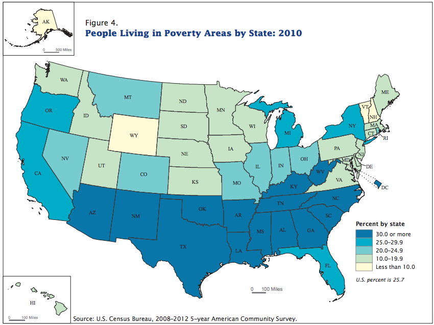
That's a common problem with images here. The work-around is to right-click on the image, then select "Open image in new tab"...and then click open the new tab. (I have to do that pretty often to see larger images, which tend to get cut off on the right edge.)
People who are wrong are just as sure they're right as people who are right. The only difference is, they're wrong.
God @The Tweet of God

User avatar
Econoline
Posts: 9607
Joined: Sun Apr 18, 2010 6:25 pm
Location: DeKalb, Illinois...out amidst the corn, soybeans, and Republicans

Re: Just a coincidence.

Post by Econoline »

Lord Jim wrote:I guess for some reason rube wanted to make the "point" that states with the highest percentages of minority population have higher poverty rates, since that's the most obvious correlation that leaps out from that map...
...or that poor people tend to move to (or stay in) warm states, so that they don't have to pay crippling heating bills?
People who are wrong are just as sure they're right as people who are right. The only difference is, they're wrong.
God @The Tweet of God

User avatar
Gob
Posts: 33646
Joined: Tue Apr 06, 2010 8:40 am

Re: Just a coincidence.

Post by Gob »

Highest percentage of blue meanies in the south?

Image
“If you trust in yourself, and believe in your dreams, and follow your star. . . you'll still get beaten by people who spent their time working hard and learning things and weren't so lazy.”

User avatar
Econoline
Posts: 9607
Joined: Sun Apr 18, 2010 6:25 pm
Location: DeKalb, Illinois...out amidst the corn, soybeans, and Republicans

Re: Just a coincidence.

Post by Econoline »

:lol: Well, yeah, of course...that goes without saying!
People who are wrong are just as sure they're right as people who are right. The only difference is, they're wrong.
God @The Tweet of God

User avatar
BoSoxGal
Posts: 20047
Joined: Tue Apr 06, 2010 10:36 pm
Location: The Heart of Red Sox Nation

Re: Just a coincidence.

Post by BoSoxGal »

I thought I posted a reply, but I guess it was lost to the interwebs.

First, thanks Econoline for that trick on viewing large images.

Second, I think rather than minority populations, the correlation he's getting at is conservative politics and poverty.

There is a fairly high minority population in Alaska, Hawaii, Montana, etc. but the poverty isn't that high and the politics aren't that same brand of religious conservatism - more libertarian in Alaska and Montana, and I'm guessing Hawaii is liberal (I regret to say, I never pay attention to it).
For me, it is far better to grasp the Universe as it really is than to persist in delusion, however satisfying and reassuring.
~ Carl Sagan

rubato
Posts: 14245
Joined: Sun May 09, 2010 10:14 pm

Re: Just a coincidence.

Post by rubato »


rubato
Posts: 14245
Joined: Sun May 09, 2010 10:14 pm

Re: Just a coincidence.

Post by rubato »

JUST a coincidence:


Image


When more people believe that that people in poverty "have it easy" it creates more, and deeper, poverty.


yrs,
rubato

User avatar
Sue U
Posts: 9101
Joined: Thu Apr 15, 2010 4:59 pm
Location: Eastern Megalopolis, North America (Midtown)

Re: Just a coincidence.

Post by Sue U »

Lord Jim wrote:I guess for some reason rube wanted to make the "point" that states with the highest percentages of minority population have higher poverty rates, since that's the most obvious correlation that leaps out from that map...
That is patently untrue. California, New York, New Jersey, Maryland and Nevada all have higher percentages of minority populations than most of the states in the Deep South poverty belt. In terms of African-Americans alone, Maryland has a higher percentage than all states other than Mississippi, Louisiana and Georgia. Delaware, New York, Illinois and New Jersey all have substantially higher percentages of African-Americans than Texas, Kentucky, Oklahoma and West Virgina.
GAH!

User avatar
Joe Guy
Posts: 15385
Joined: Fri Apr 09, 2010 2:40 pm
Location: Redweird City, California

Re: Just a coincidence.

Post by Joe Guy »

The point rubato made that people are avoiding is obvious. He is letting us know that republicans are responsible for all of the poverty in this country.

Who would have thought rubato would say something like that?

Then again, who would have thought rubato would not say something like that?

Or is it just a coincidence?

User avatar
Lord Jim
Posts: 29716
Joined: Thu Jun 10, 2010 12:44 pm
Location: TCTUTKHBDTMDITSAF

Re: Just a coincidence.

Post by Lord Jim »

In reviewing this more closely, one should bear in mind that what these maps are measuring is not how many people are really living in poverty, (as defined by the Census Bureau; more on that in a moment) but how many are living it what are called "poverty areas", whether they are actually living under the poverty line or not..

Here's how the website rube references describes a "poverty area":
places where more than 20 percent of the population lives under the poverty line, currently around $23,600 for a two-parent family of four, according to a new report from the Census Bureau.
http://www.vox.com/2014/6/30/5857074/wh ... ncentrated

Under this metric, nationwide, the percentage of people living in "poverty areas" is 25.7%...

A figure some 70% higher than the Census Bureau reports of people who are actually living in "poverty"...

15.1%...

Rube's source admits this, and I have confirmed it independently by another source I will cite later, using the same 2010 Census Bureau numbers:
Around 15 percent of Americans live in poverty,
http://www.vox.com/2014/6/30/5857074/wh ... ncentrated
How many people were poor in 2010?

In 2010, 15.1 percent of all persons lived in poverty.
http://www.npc.umich.edu/poverty/

Now, it seemed to me, that if we were going to use "poverty areas" (which doesn't actually measure the number of people who are actually living in poverty) as some sort of meaningful metric for assessing poverty, some basic questions needed to be answered:

How are these "poverty areas" determined? What geographical and/or demographic criteria are used to the determine the boundaries? How are these "poverty areas" drawn up?

Perhaps there are some data miners around here who are better than Your Humble Corespondent, but while I have been able to determine that "poverty area" is indeed a term of art used by the Census Bureau,

Beyond the repetition of "poverty areas" being described as "places where more than 20 percent of the population lives under the poverty line" I have been able to find absolutely nothing about how such "places" are determined...

Absent any criteria along these lines, in theory the whole of the United States could be determined to be a "poverty area" and we could declare that there is no one at all living in a "poverty area", since the requirement for living in a" poverty area" is to have 20% of the residents living below the poverty line, and in the US as a whole it's only 15.1%....

You see the problem with this...

Absent answers to these questions, this "poverty area" map is pretty much meaningless, in terms of determining the real poverty situation in the US...

Next I'd like to turn to the real issues of poverty in this country, and who if effects, (and rube should really like this, because I'm going to include Census Bureau tables...)

But this post has gone on quite long enough, and I'm going to take the lad and our pooches down to the park, so that will be Part II...
Last edited by Lord Jim on Fri Jul 04, 2014 5:12 am, edited 1 time in total.
ImageImageImage

User avatar
BoSoxGal
Posts: 20047
Joined: Tue Apr 06, 2010 10:36 pm
Location: The Heart of Red Sox Nation

Re: Just a coincidence.

Post by BoSoxGal »

I wonder if there is any correlation between heat & humidity and poverty ?
For me, it is far better to grasp the Universe as it really is than to persist in delusion, however satisfying and reassuring.
~ Carl Sagan

User avatar
Lord Jim
Posts: 29716
Joined: Thu Jun 10, 2010 12:44 pm
Location: TCTUTKHBDTMDITSAF

Re: Just a coincidence.

Post by Lord Jim »

Part II

Now, let's assume for the moment, that we were looking at "Part II"...

A part where "poverty" looks a lot more like even what the Census Bureau would call it :
cash benefits from government assistance programs are included in a family's income when calculating the official poverty measure, benefits received in-kind such as food stamps, Medicare or Medicaid, employer provided health insurance, housing subsidies, and other social services are excluded. Taxes that families pay and tax credits they receive such as the Earned Income Tax Credit (EITC) do not enter into the official poverty determination.
So on top of the fact that "poverty" is being rated without all these in kind contributions, including the EITC,

There's a whole new definition of poverty....
The poverty rate for all persons masks considerable variation between racial/ethnic subgroups. Poverty rates for blacks and Hispanics greatly exceed the national average. In 2010, 27.4 percent of blacks and 26.6 percent of Hispanics were poor, compared to 9.9 percent of non-Hispanic whites and 12.1 percent of Asians.

Poverty rates are highest for families headed by single women, particularly if they are black or Hispanic. In 2010, 31.6 percent of households headed by single women were poor, while 15.8 percent of households headed by single men and 6.2 percent of married-couple households lived in poverty.][Say what you want about Rick Santorum; he's absolutely right when he talks about two parent families and the avoidance of poverty...the numbers don't lie..)

There are also differences between native-born and foreign-born residents. In 2010, 19.9 percent of foreign-born residents lived in poverty, compared to 14.4 percent of residents born in the United States. Foreign-born, non-citizens had an even higher incidence of poverty, at a rate of 26.7 percent.

http://www.npc.umich.edu/poverty/#4
Last edited by Lord Jim on Fri Jul 04, 2014 10:36 am, edited 3 times in total.
ImageImageImage

User avatar
Lord Jim
Posts: 29716
Joined: Thu Jun 10, 2010 12:44 pm
Location: TCTUTKHBDTMDITSAF

Re: Just a coincidence.

Post by Lord Jim »

In 2010, 31.6 percent of households headed by single women were poor
http://www.npc.umich.edu/poverty/

No doubt about it, that must be Ronald Reagan's fault...

ETA:

And that is precisely the group that benefits the most from the in-kind contributions to income; Section 8 housing, food stamps, and the rest...

Look I'm not a scrooge, I don't begrudge people in those circumstances those benefits, but let's not pretend that those benefits don't exist...

When you calculate the "poverty level" without taking those benefits into consideration, you create a false picture...
ImageImageImage

User avatar
Lord Jim
Posts: 29716
Joined: Thu Jun 10, 2010 12:44 pm
Location: TCTUTKHBDTMDITSAF

Re: Just a coincidence.

Post by Lord Jim »

Poverty rates for blacks and Hispanics greatly exceed the national average. In 2010, 27.4 percent of blacks and 26.6 percent of Hispanics were poor, compared to 9.9 percent of non-Hispanic whites and 12.1 percent of Asians.

Poverty rates are highest for families headed by single women, particularly if they are black or Hispanic. In 2010, 31.6 percent of households headed by single women were poor, while 15.8 percent of households headed by single men and 6.2 percent of married-couple households lived in poverty.

In 2010, 19.9 percent of foreign-born residents lived in poverty, compared to 14.4 percent of residents born in the United States. Foreign-born, non-citizens had an even higher incidence of poverty, at a rate of 26.7 percent.
So, what one would logically expect, is that those states with the highest percentages of those groups with the highest numbers below the poverty line, would be the states with the highest poverty rates overall. That's just logic and basic math, and doesn't have anything to do with how many "poverty areas" there are in a state or how many people live in those "poverty areas".

State A could very easily have a higher percentage of people living below the poverty line then State B and still show up better on the map in the OP, simply because their poor people are more spread out, or because the "poverty areas" have been gerrymandered in some way.
Last edited by Lord Jim on Sun Jul 06, 2014 3:22 am, edited 4 times in total.
ImageImageImage

User avatar
Lord Jim
Posts: 29716
Joined: Thu Jun 10, 2010 12:44 pm
Location: TCTUTKHBDTMDITSAF

Re: Just a coincidence.

Post by Lord Jim »

Here's a much better map; it actually measures people living below the poverty line; not "poverty areas":

Image

The color coded legend won't copy and paste, (basically the darker the state the worse the rate) so you'll have to go to the link(You can also see a breakdown by county):

http://en.wikipedia.org/wiki/List_of_U. ... verty_rate

You can also see a table with all the states ranked in order at that link. (California is 35th and New York is 38th)

ETA:

For folks who are really interested in this stuff here's a link to another good map:

http://www.povertyusa.org/the-state-of- ... map-state/

This is an interactive map. You can click on a state and drill down on the numbers. (You can also do counties) The numbers are drawn from the CPS; they're slightly different from the other link, (it's an anti-poverty activist site, so the percentages appear to be a little inflated across the board) but they show basically the same differentials.
ImageImageImage

Post Reply